An Organized Approach to Improving Schedule Displays
Paul F. Bolinger 7/1/2014
This paper was originally published in the College of Performance Management’s Measurable News, third quarter 2014.
This paper establishes a set of guidelines to improve the display of schedules.
Too often, large amounts of time and effort are put into project planning and scheduling only to be unavailable for, or hidden from, general usage by the obscurity of the systems used and the lack of neat clean ways to provide quality graphical schedule information at the project summary level. There are already tools available to build high impact top level schedules linked to the detailed networks below; now we have guidelines to help us use those tools to make our schedule displays even better.
The Schedules Display Guidelines (SDG)
In this paper, we will look at some defined guidelines and examples of what should be best practices in displaying schedules. Each schedule display guideline [SDG] has been derived from underlying research into human perception and processing of visual information. Colin Ware & Stephen Few have written very important works about information display, and Ware has published a set of guidelines on display of information in general. This paper adopts the guideline approach Ware used effectively, and specifically applies those guidelines to the display of schedules.
Each schedule display guideline will be stated, explained, and supported with an example. The assumption is that these schedules rest upon a disciplined lower level set of high quality schedules that meet the generally accepted scheduling guidelines (GASP). We are focused on the display of schedule information, not on the scheduling techniques and measures.
Guidelines and Supporting Arguments
[SDG 1.0] Identify the intended viewers of the schedule and prepare the display accordingly. Each audience can have a different level of interest in a project or program schedule. The right display approach for one audience can easily be totally wrong for another. For top level schedules, the display should present summary material relevant to the needs of the audience.
Some examples of target audiences are:
- Customers – who are interested in understanding the project from their point of view; when do they get what they ordered and what is their involvement.
- Company executives – who are interested in understanding the project and having a tool (the schedule) to use to inform others about the project.
- Project Team – who are interested in having a useable and understandable road map they can refer to as they proceed along the path to the goal.
The example provided later in this paper will be for customer executives intended to help them to follow progress and to explain the project to others. These executives want a one page overview schedule linked up from the detailed electronic schedules that they can confidently use to brief others on their project.
[SDG 2.0] Identify the environment; what is it you are going to describe in your schedule. Questions you must resolve before you make key decisions about the display are; will you be dealing with multiple projects, a single project, a single project with multiple goals, a single project with multiple high-level players like team mates or subcontractors, multiple phases of a project, a short period or a long period?
The example provided later in this paper is a single project for a U.S. Department of Defense customer. It will span multiple years and include design, fabrication, assembly, testing and support efforts to document the system. This is not a real project but represents the type of challenges found in real projects.
[SDG 3.0] Understand the project you are going to display. What is unique about the project? What message needs to be given to help the viewer understand the project? Remember that important details are obscured in the network centric scheduling software; the summary level schedule is the place where crucial components can be highlighted and emphasized.
The example project provided later in this paper is one in which a shipboard fire control system, consisting of hardware and software components, will be upgraded to meet new threats. Running parallel to this effort, the target drone fleet will be upgraded to be able to simulate the new threats. The shipboard modifications and the upgraded drones will be performed by two major sets of suppliers. The two parts of the project must come together for live fire testing. What should be emphasized is the parallel development of the shipboard system with the modifications to the target drones under the DoD project life cycle, with its various reviews and customer participation coming together at the goal.
[SDG 4.0] Design the type of schedule based on the audience, environment, and specific uniqueness of the project to provide the message you have. A comprehensive high level project roadmap might be just the thing for a schedule to be used with the customer or company executives, while a birds-on-a-wire type schedule might be better for combining multiple projects that must be shown together. A phased type schedule would work best on a multi-phased project. For the project team, the schedule should focus on their particular challenges. Each of those choices yields a different looking display.
The example will be a comprehensive high level project roadmap that includes the two major efforts, along with the supportability tasks needed to make an entire project. Because it is a single project, the use of birds-on-a-wire, phased, or other multi-project orientations have been discarded in favor of a road map approach. The road map is the highest level summary, but is intended to cover the entire project, start to finish, on a single page no larger than 11×17. To meet this challenge the display software will be used to “hand pack” the plan onto the single page before it is linked to the underlying network schedules.
[SDG 5.0] Select the background and frame to best fit the environment for the schedule. How the display is framed and subdivided significantly impact on how it is viewed. Do you want a plain blank background or do you want to subdivide the background in any way? Should your schedule have horizontal swim lanes to focus on sequential related work? Do vertical lines help you make your point? What calendar display should you use? Should you have a legend; do you need one?
Background color selection must be done in coordination with the color scheme for the symbols so that the proper amount of contrast can be established to help let the symbols stand out on the background. The correct background color will enhance the readability and impact of the display.
Because this example is a U.S. Navy project, colors in the blue and gold realm will be used in the background. In this case, swim lanes would make it more difficult to portray the two major efforts of the project coming together since swim lanes tend to keep elements separate. Because the project is a multi-year, vertical drop lines for the years will be used to help the viewer see the plan unfold across them. The background is a light color that recedes into the frame of the calendar. The calendar shows three levels: year, quarter, and month for clarity.
All graphic examples in this paper were produced using Milestones Professional 2012 Version.
[SDG 6.0] Group the display to best tell the story of the project, emphasizing the project flow from start to the various goals. Grouping is one of the key decisions in building the display. This is best done when the groups are natural or logical. The groups can be vertical groups related to timing like phases, horizontal groups of related types of work, groups by performer or supplier, or done to emphasize some other important grouping. If a project has a single goal, the waterfall top-to-bottom and left-to-right approach might be best. If the project has more than one goal, you should evaluate if the work can be grouped to show those various thrust or interest areas? If the project has some major subprojects or major players, would those factors lead you to a specific grouping set of criteria?
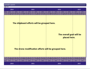
In this example two major groups will be built to show the shipboard and the drone efforts as groups coming together for the goal. A third group will be put at the bottom to contain miscellaneous work.
[SDG 7.0] Select and use as small a set of standard symbols as you need to cover the environment. Symbols should be standardized across the schedules developed by an organization or company. Once a usable set of symbols is employed and used rigorously, the level of ease of perception, recognition, and interpretation will improve and the speed of comprehension will grow.
The idea of standardizing is a way to help us move more quickly from perception to cognition. After all, we are using the schedule information so that we can think about the schedule, the project, the issues, the outcomes, and so on. That is cognition or analysis. The schedule is a tool to help us with our cognition so we don’t want the schedule itself, the way it is presented, to get in the way. On the contrary, we want to have the best way to quickly get the message to the thinking part of our brains.
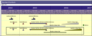
[SDG 7.1] Landmark milestones should be unique in shape and color as well as position. Landmark symbols are important symbols that would show on every page or would show on the prime contractor and subcontractor schedules to anchor the various versions in the eyes and minds of the readers.
Because this is a U.S. Navy project the shape of a ship has been used as the landmark symbol for top level milestone. The other symbols show milestones as triangles so that they come to a point at a specific date. Other bars are used to show durations and durations with special attributes. These special task bars will help the reader spot uniqueness in the plan. Deliveries are shown as a unique diamond shape to help the eye find them on the plan.
[SDG 8.0] Use a few basic colors to differentiate and highlight your schedule display; red, green, yellow and blue are good choices for basic presentations. Colors are easily perceived if selected carefully. The research indicates the colors best suited to display. Colors can be a negative factor if they have emotional content.
In this example the same symbols will be kept but colors will be modified for emphasis. The shipboard tasks will be one color scheme while the drone tasks will be another. Deliveries will be a consistent green diamond since green provides the idea of “go”. Ancillary tasks will default to the shipboard scheme rather than having a third color scheme which would make the plan less readable. Where the two efforts come together, the final joint effort will be highlighted by color.
[SDG 9.0] Prioritize the display to enhance the story. Priority can be established by size, color, sequence or a combination of techniques. Priority in schedule display leads the viewer through the schedule so it is an important concept and an important attribute of the display.
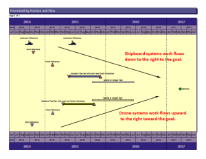
Place important landmark milestones at the top. Prioritize your groups in logical order according to the specific project goals. In this example, the shipboard systems will be positioned just below the landmark milestones and will waterfall down to the right to the goal. This implies that the shipboard system work “leads off” and is of high importance. The drone systems will flow upward from the bottom left to the goal, The “Vee” shape will emphasize the supportive nature of this effort and how the two major thrusts come together at the goal.
[SDG 10.0] Add comments to the schedule at important decision points, important transition points, and to enhance comprehension where that is needed. Movement from one phase to another is an important transition that you could explain. The sequential transition from design, to build, to testing marks major changes in the type of work on a project; these points would be logical places for comments. Decisions that dramatically affect the project should be mapped onto the schedules and highlighted with comments. For example, the decision whether or not to authorize additional product builds, or other follow-on efforts, are important points in a plan.
[SDG 11.0] Examine the display and analyze it according to its adherence to the guidelines as well as its impact. Does it get the job done? Modify as needed to complete the display. Try it out on people to see if they can spot weaknesses or suggest improvements.
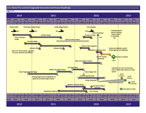
Here is the final example of the plan. Review and analyze this display in terms of its adherence to the guidelines and how far it goes in providing the top level executive summary schedule needed for the project.
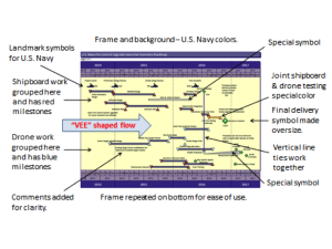
The analysis of the final overall example shows the elements added that correspond with the schedule display guidelines.
Paul F. Bolinger is an Engagement Director with Humphreys & Associates consulting in project management with a specific emphasis on project scheduling. His experience with project scheduling tools like Primavera and Microsoft Project has proven there is a need for high level well-constructed schedule displays. He has consulted on many projects including electronics, aerospace, nuclear power, shipbuilding, and construction.


